Picture a detective in an old-timey TV show.
He arrives on the scene – sporting a fedora and trench coat – and all the local police are stumped. Guided by no clues or evidence, he decides to pursue someone as a primary suspect.
Why? Because he has a hunch.
If you pull back to reality, you realize this is ridiculous. In the real world, he needs actual tools, facts and evidence to properly steer the direction of his case.
Marketers are in a similar boat, and their evidence is data, and increasingly, data visualization.
What Is Data Visualization?
In previous decades, business owners would put up a billboard because they a) wanted to promote their companies to bring in new customers and b) they wanted their face on a great big billboard because it’s neat to have your face on a great big billboard.
Now how do they tell if any new business is a direct result from the billboard? Unless the customer flat-out said, “I saw this place on your billboard!” there wasn’t much in the way of tangible evidence.
Utilizing the modern tools that the internet provides, your company can gain a wealth of information – or, in this sense, data.
There’s almost a limitless amount of data that you can gather for your company – demographic information on those who clicked on your online ads, which products were being looked at, how often and how long were they were on your site, etc.
So many numbers.
Data visualization takes those numbers and puts them into beautiful and easy-to-digest visuals.
Essentially, it turns this:

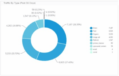
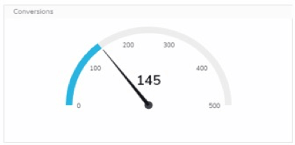
Into this:

How Does It Work?
The term data has gotten some bad PR lately because of scandals involving some of the world’s greatest tech giants. Collecting data is not necessarily bad. In fact, this process doesn’t need to be intrusive to be incredibly useful for a company.
Let’s say I run a trampoline company – Trent’s Trampolines.
I could put up a billboard or run a print ad and hope for the best, but how do I know how many people saw it? How do I know how many people who are actually interested in buying a trampoline saw it?
Instead, I elect to go a different route. I use targeted online advertisements (that’s a whole different blog for another day) and I run my campaign.
Now I get all this data. This includes these points, to name a few:
- How many people clicked on the ads
- Where these people are located
- What people were searching for when they came across my page
DeanHouston takes data from multiple sources (Facebook, Google Analytics, Instagram, etc.) and funnels it into one easy platform. The system then turns the numbers into those beautiful charts and graphs.
What’s In It for Me?
Not only is this visualized data beautiful, it’s also incredibly useful. It can be customizable to make things as simple or as detailed as I want.
I could have something that looks like this:

Or something a little simpler, like this:

Instead of blindly going with my gut, I have facts and figures that I can interpret and use to make educated decisions on what to do next. I get a more concrete look at where I’ve been, where I am now and where I could go. This is where I’ve been strong. This is where I need to reallocate resources. This is where I can target my campaigns.
Now I have a full book of well-informed, easy-to-read data to help lead me out of the wilderness. This will help me craft a strategy for growth.
It’s much better than using that hunch.
